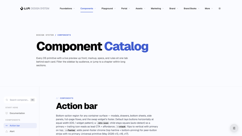
Components

Every component with a live preview, and its markup, specs and rules in the tabs.

Action bar .action-bar
A group of actions at the bottom of a dialog, panel or flow.

Default

Single button

Primary with icon button

Stacked

Three actions

Panel footer

Panel content above the footer…

Alert .alert
An inline banner for notices, status and warnings. Use Notifications for messages that float over content.

Small

Solana mainnet is now routable.

Quote locked in at 0.04% slippage.

Quote expires in 8 seconds.

RPC timeout — switching to backup provider.

Default

New chain supported

Solana mainnet is now routable. 40+ tokens available on day one.

Route confirmed

Stargate via Polygon → Arbitrum settled in 12s with 0.04% slippage.

High slippage detected

This route shows 1.8% price impact. Consider reducing trade size or waiting for liquidity to rebalance.

Approval failed

Spend allowance for USDC was rejected. Reconnect your wallet and try again.

Large

Widget SDK v2.4 released

Adds onRouteSelected event hooks, custom theming via CSS variables, and three new chains. Migration is non-breaking — see the changelog for opt-in flags.

Cross-chain swap settled

100 USDC on Polygon converted to 99.94 USDC on Arbitrum through Stargate. Final gas: $0.42. Receipt sent to your connected wallet.

MEV protection unavailable on this route

The chosen RPC doesn’t support private mempool submission. Continue anyway, or switch to a protected route from the list below.

Allowance below required amount

USDC allowance on Ethereum is 50 USDC but the swap requires 250 USDC. Approve the higher allowance or reduce the trade size.

With actions, with a list, without dismiss

Quote expiring soon

Settlement window closes in 12 seconds. Refresh to lock in the current rate or accept the original quote.

Transaction rejected

The swap could not be submitted for these reasons:

  • Insufficient ETH balance to cover gas on Ethereum
  • Allowance below the required amount on the source token
  • Slippage tolerance exceeded between quote and execution

Persistent confirmation

No dismiss control — for permanent banners that should stay visible until the underlying condition clears (e.g. “Test mode enabled”).

Avatars .avatar
A brand mark or monogram identifying a person, organisation, chain, token, bridge or wallet.

Sizes

Ethereum (24px)
24 px
Ethereum (32px)
32 px
Ethereum (40px)
40 px
Ethereum (48px)
48 px
Ethereum (64px)
64 px
Ethereum (96px)
96 px

Shapes

Arbitrum (square) Arbitrum (rounded) Arbitrum (circle)

Ring

Ethereum (no ring) Ethereum (with ring)

Stack

Ethereum Arbitrum Ethereum Arbitrum Optimism Ethereum Arbitrum Optimism Base

Stack overflow

Ethereum Arbitrum Optimism +5 Ethereum Arbitrum Optimism +12 Ethereum Arbitrum Optimism +99

Tandem

USDC on Ethereum USDT on Arbitrum USDC from Ethereum to Arbitrum USDC on Arbitrum via Eco

Two-badge tandems are reserved. Product rows carry one badge, the chain; see Rules.

Tandem sizes

USDC on Ethereum (24px) USDC on Ethereum (32px) USDC on Ethereum (40px) USDC on Ethereum (48px) USDC on Ethereum (64px) USDC on Ethereum (96px)

Placeholder

Pair it with a “Select” label in the chip. Never put a glyph in the disc.

Initials

Up to two letters, from the first and last word. A hash of data-initial picks one of 12 --spectral-* tones, so a label has the same colour everywhere.

Initial tones

AR ML SC DK PN TB WZ YS JK RA LM EN

Every tone is dark enough for white letters to pass WCAG AA (5.1:1 or more) in both themes.

Initial sizes

VR VR VR VR VR VR

Same size modifiers as every avatar. The letters scale with the disc (font-size: calc(--avatar-size × 0.4)).

Flat and neutral initials

LF SY

--flat is a solid fill for dense table cells. --tone-neutral is for non-human entities, such as System or a pending invite.

With a name

Ethereum Ethereum Arbitrum Arbitrum USDC USD Coin
Badge .badge
A count, label or dot on the corner of an icon or avatar. Use Chips for labels within content.

Content

4 99+ NEW

Sizes

4
20 px
12
24 px
Dot, 12 px

Tones

4 4 4 4 4 4

Anchors

4 4 4 4

Hosts

4 3 Ethereum NEW Base NEW
Button System
Controls for taking actions, with visual weight showing which action matters most.

Primary

The main action on a surface, filled or outline.

Filled

Outline

Disabled and busy

Variants

Secondary

Neutral

Tertiary

Destructive

Success

Link

Trailing icon

Icon only

Inline links

By submitting this form you agree to our Privacy Policy and Terms of Service.

Read the integration guide or explore our SDK documentation.

© 2026 LI.FI. Privacy · Terms

Sizes

.btn-sm · 32px tall · 8/20 padding · 12px label · 8px radius
default .btn-primary · 40px tall · 12/24 padding · 14px label · 12px radius
.btn-lg · 48px tall · 12/32 padding · 16px label · 16px radius
.btn-xl · 56px tall · 16/40 padding · 18px label · 20px radius

Lift .btn-lift

Adds a hover lift and glow, for marketing CTAs.

Hover both rows. The top row is the static default; the bottom row adds .btn-lift.

Justify .btn-justify

Puts the label and the arrow at opposite edges of a full-width button.

Default

Explicit arrow icon

Large secondary, long label

Accent tints

With icon .btn-with-icon

A label button with a leading or trailing icon. For icon-only, use .btn-icon.

Automatic trailing arrow

Leading icon

Leading and trailing

Swap-direction FAB .ui-swap-arrow

The direction toggle between two amount cards in .ui-amount-pair.

Default

FAB tier

In context

Real .ui-amount-card markup at the playground's 368 px width. The cards are masked, so they are transparent around the FAB.

Send 25% 50% MAX
100 USDC
Receive
0.0449 ETH
Chips
Small pills identifying status, categories, tokens or changes in value. Use Badge for corner indicators.

Pills

Chip .chip

The base pill, filled or outline, with an optional icon on either side.

Filled

60+ Chains Expired Active AI-Powered Agentic Route Found Pending Price updated Rejected

Outline

60+ Chains Expired Active AI-Powered Agentic Route Found Pending Price updated Rejected

Sizes

default · 24h md · 32h lg · 40h xl · 48h

With icon

Mainnet Live Pending Open Filter Verified

Avatar chip .chip-avatar

A pill with a leading .avatar, for tokens, chains, partners and wallets.

Sizes, click to select

Tones

Borderless

No fill at rest; the fill appears on hover, press and focus. Use it on a <button>.

Single avatar

Selected

Placeholder

Token and chain pickers use .avatar-tandem--placeholder; chain-only pickers use .avatar--placeholder. The chip’s aria-label names the action.

Locked

ETH USDC Ethereum

A value the user can’t change here, as in the Modify-limit-order pair. Read-only, not disabled.

Editable chip .chip-edit

A label that turns into an input when clicked.

Default

Tones, click to edit

Delta indicators

Delta chips .chip-delta-pos · --neg · --neutral

A percentage change, up, down or flat.

Directions

0.0% +12.4% −3.1% +$128.4M −421 users

Sizes

+12.4% · default +12.4% · md +12.4% · lg +12.4% · xl

In context

Standard KPI
$1.24B
Larger tile
$842M
Hero tile
$18.4B
Banner / print hero
$21.6B

Bare chips .chip--bare

A chip with no fill, border or padding, for inline price readouts.

Price readout

0.15%5m 0.1%1h 0.53%6h 0.65%24h

Sizes

0.15% default, 12 px
0.15% md, 14 px
0.15% lg, 16 px
0.15% xl, 18 px

Tones

+12.4% −3.1% 0.0% Settled Reverted Pending Mainnet

Themed

Chip shortcuts
Preset buttons that fill a numeric field, such as an amount or slippage setting.

Chip shortcuts .chip-shortcuts

Sizes

Set by the .chip--* class on each child.

Default

~24 px

Medium

~32 px

Large

~40 px

Variable count

3 slippage presets

5 gas-fee tiers

6 percent shortcuts

Reveal on hover .chip-shortcuts--reveal-on-hover

Chips stay hidden until the parent is hovered or focused, then fade in from the right.

Hover the card, or tab into the input.

Send

$100.00 · Balance 2,645.15

Code chip .code-chip
An inline monospace label for code terms and class names in documentation.

Any inline <code> renders as a chip: .btn-primary, --space-16, shared.js.

Brand button .btn-primary

In a .ds-doc-card__label the chip is quieter: 0.72em, weight 500, muted.

In-page · .eyebrow-numbered

In a .ds-doc-eyebrow it is 1em and stays lowercase.

Drawer handle .drawer-handle
An edge tab for opening and closing a side panel.

The chevron points left while the panel is open and right once the consumer’s state class rotates it. Make the handle a sibling of the panel, not a child, so it stays flush during the slide.

Rest

Hover

Flipped when collapsed

Empty state .empty-state
A message for a region with no content or results. Use Skeleton while content loads.

Icon + message

Select a first token to see its market price

Icon + title + message

No price data

Pick a token to load its live market price and 24h change.

Icon + title + message + action

No transactions yet

Your swap and bridge history will show up here.

Tinted icon

Couldn't load routes

We hit an error fetching quotes.

Error detail .error-detail
A monospace box for technical failure details below a plain-language error message.

An on-chain revert, from the Portal withdraw-fees error state, and a failed webhook.

Error · Insufficient_gas

execution reverted: gas estimation failed at block 218682389

Error · Delivery_failed

POST https://api.rabby.io/webhooks/lifi returned 500 after 3 retries · request id 0x3594…793b5

Eyebrow
A small label above a heading that identifies its category or context.

In-page eyebrow .eyebrow-code · .eyebrow-word · .eyebrow-numbered

Above section titles and definitions.

Code (developer)

Foundations
Enable trading on your app

Word (editorial)

Use case — Real World Assets
Access every tokenized RWA

Numbered

01 Model Tiers
Four models, one decision

Accent number

02 Repo Reality
Three repos, three pacing modes

Custom tones

03 Task Playbook
Patterns that actually scale

Hero eyebrow .header-eyebrow

Above a marketing hero H1, in one colour or two.

One colour

Catalog v2.0

Two colours

Use Case Wallets

Pane eyebrow .ds-doc-eyebrow

Above demos in catalog Preview panes.

Primary action · .btn-primary

Floating Action Button .fab
A floating icon button that keeps a page-level tool within reach.

Button .fab

Click to toggle .is-open; the icon swaps to a close icon.

Menu panel .ds-doc-menu-panel

Icon button .btn-icon
A compact control for a familiar action that an icon can identify, such as close or settings.

Sizes

24 px
32 px
40 px
56 px

Colour

Default
Muted

Hover tint

Neutral
Accent

In a screen header

Form Controls
Fields and selection controls for entering information and changing settings.

Variant matrix

Every size and label position.

VariantSizeLabelUse when
.input.input--smsm · r12 · 8×12 · 14 px · 38 pxStacked, .form-label.form-label--smFAB panels, sidebar settings, drill-down editors.
.inputmd (default) · r12 · 12×16 · 14 px · 46 pxStacked, .form-labelMarketing forms, account forms, full-width forms on their own surface.
.input.input--lglg · r20 · 16×20 · 16 px · 54 pxStacked, .form-label.form-label--lgHero sign-up bars, prominent single-field forms.
.field-inline.field-inline--smsmInlineDense inline editing, table-cell editors, filter rows.
.field-inlinemd (default)InlineThe label names the field (card meta, modal rows, swap pairs).
.field-inline.field-inline--lglgInlineHero amount entry, prominent currency / token pickers.
+ .input--tinted
+ .field-inline--tinted
Modifier, any sizeEitherA deliberate brand tint on a neutral surface.
+ .field-inline--has-trailModifier; right-edge slot for .field-trailInlinePassword show/hide, clear-field, unit toggles.

Text & numeric

Text input .input

A single-line field with a label above and an optional hint.

Connected: 0x1a2b...8f9e
Select the chain you want to receive on

Select .select

A native select styled like .input.

Textarea .textarea

Multi-line field. It grows as you type; set the minimum height inline or with --lg.

We'll get back to you within one business day.

Number input type="number"

Native number field with min, max and step.

1–100, integer step.

Sizes & label positions

Small .input--sm

For FAB panels and drill-down editors. Add --sm to the control and its label.

Inline label .field-inline

The label sits inside the field.

Inline label, small .field-inline--sm

For table-cell editors, renaming and dense filter rows.

Large .input--lg

Only when the field is the main action, such as a sign-up bar.

Modifiers

Tinted --tinted

Adds the brand tint to a field.

Trailing button --has-trail · .field-trail

A button at the right edge of .field-inline, such as show / hide password.

Invalid --invalid · aria-invalid

A danger border and focus ring, with a .form-error message.

Enter a valid email address.

Read-only :read-only

A value the user can select but not edit, such as a computed total or generated key.

Read-only — copy with ⌘C.

Leading icon --has-lead · .field-lead

A decorative icon at the left edge, such as a search magnifier.

Selection

Checkbox .checkbox

A native checkbox wrapped in its label.

Switch .switch

An on/off toggle that takes effect immediately.

A <label> around a native checkbox, so keyboard, screen readers and forms work without JS.

sm · 34 px row
default · 42 px row
lg · 54 px row

Playground preferences

Universal pattern — .setting-row hosts a label, optional description, and any control on the right (switch, input, select, button group). Pair sizes 1:1 between the row and the control.

Auto-refresh quotes
Repoll route data every 15 seconds while the form is open
MEV protection
Route through private mempools when available
Refresh interval
How often to repoll quotes
Show test networks
Sepolia, Holesky, Mumbai, and other staging chains
Auto-execute approvals
Approve token spend without an explicit confirmation step
Reduce motion
Tabular numerals
Compact density

Composition

Setting Row .setting-row

A card row for a setting, a sub-screen link or a collapsible section.

Drill: a <button> row that opens a sub-screen. Settings: a label and optional description with a control on the right. Expand (--expand): a head with a value summary and a chevron that opens a .reveal drawer.

Row 3 has no value; the column collapses on its own.

Refresh interval
MEV protection
Route through private mempools when available
Slippage tolerance
Max % the price can move before reverting
Display currency

The fourth row uses a .dropdown: the default trigger, not --bare, with .dropdown__panel--align-end.

Across
Stargate
1inch

A logo instead of an icon, as in the playground’s Bridges & Exchanges toggles. No modifier needed.

Drawer content — controls, tile grids, slider fields. The drawer owns padding so the collapser stays bare.

The __value summary can hold .swatch--xs dots — the Theme Composer’s Colors head shows the four seed colours this way.

Closed rows still read their state — the stack doubles as a one-screen overview.

Click a head to open it. Used by the Theme Composer’s sections.

Form anatomy

ElementClassRole
Field group.form-group · .form-group--smWraps a label and control; margin-bottom 24 px (16 px on phones), 8 px for --sm.
Field row.form-rowTwo columns; one column under 600 px.
Stacked label.form-label · .form-label--sm · .form-label--lgLabel above the control: 12 px uppercase (--sm), 14 px, 14 px (--lg).
Control (stacked).input · .select · .textarea + --sm / --lg / --tinted--field-* colours; --tinted adds the accent.
Inline wrapper.field-inlineHas the background, border, radius and :focus-within ring.
Inline label.field-labelSmall uppercase muted label; pointer-events: none.
Inline control.field-input · .field-select · .field-textareaUnstyled; takes only type.
Trailing slot.field-inline--has-trail + .field-trailIcon button at the right edge; reserves 30 / 36 / 42 px (sm / md / lg).
Muted helper.muted.muted--fieldHint below a stacked control; links are styled automatically.

Form card .form-card

A panel for a whole form, with a light accent tint.

Get in touch

Error message .form-error

A validation message below a field, in place of the hint.

3–32 characters. Learn more.

Too short — 3 characters minimum.

Text prefix & suffix .field-prefix · .field-suffix

Short text before or after the value, such as “$” or “%”.

Color field .color-field

A swatch, an editable colour value in HEX, RGB or OKLCH, and a copy button.

Click the swatch, paste a value such as oklch(67.6% 0.217 39), or change the format.

Default

data-color-field="<hex>" wires it; it fires a bubbling color-change event.

Search with clear --has-lead + --has-trail

A magnifier on the left and a clear button on the right.

Kbd .kbd
A keycap label showing the keyboard shortcut for a control or action.

Sizes

.kbd--sm (16 px)
.kbd default (20 px)
.kbd--lg (24 px)

Single keys

A minimum width keeps single characters (K, /) square.

Clusters


Inline hints

Press to open the command palette.

Use   to navigate, to select, to dismiss.

Lists
Repeated rows for browsing, selecting or managing items, with optional icons, details and actions.

Anatomy

List item .list-item

A row of __lead, __body and __trail inside a .list.

Single-line

  • Ethereum
  • Arbitrum
  • Polygon

Two-line

  • Connected wallet
    0x1a2b…8f9e · MetaMask
  • Slippage tolerance
    Auto · usually 0.50%
  • Route preference
    Best Return · 23 paths checked

Lead content recipes .list-item__lead

The lead positions its content and never sizes it; rows align on the widest lead.

  • Plain SVG
    Default — drop a <svg> straight into the slot
    20×20
  • Spot icon tile
    .spot-icon — tile + tinted glyph; sizes lg/xl/2xl/3xl
    32×32
  • Spot icon — large, toned
    .spot-icon-lg + .spot-icon--info for accent-tinted tiles
    40×40
  • VR
    Avatar — initials or photo
    .avatar + --circle — 40px default; --sm/--md/--lg/--xl
    40×40
  • Status dot
    Inline 8×8 span on a semantic colour — --success / --warn / --danger
    8×8
  • Checkbox / radio
    Native form control — wraps the row in <label> for click-anywhere selection
    ~16×16

Content variants

Avatar list .list-item + .avatar

Avatar, name and role, with an optional action.

  • PA
    Philipp Zentner
    CEO · philipp@li.fi
  • AB
    Arjun Bhuptani
    Founder · Connext (partner)
  • VR
    Vilen Rodeski
    Director of Design · LI.FI

Activity feed .list-item + .list-item__meta

Status dot, event and timestamp in __meta.

  • Swap settled · 1.25 ETH → 4,237 USDC
    Ethereum → Arbitrum · via Across
    2m ago
  • Quote refreshed
    23 paths · best 0.94% slippage
    14m ago
  • Allowance approval pending
    USDT on Polygon · waiting for signature
    1h ago
  • Route reverted
    Insufficient liquidity on Optimism
    3h ago

Token row .list-item + .avatar-tandem

The token row in every product widget: .list-item--lg at 64 px, with no class of its own.

Picker, address on hover

  • on Ethereum
    ETH
    Ethereum 0xC02a…6Cc2
  • on Ethereum
    USDC
    USD Coin 0xA0b8…eB48
  • on Ethereum
    DAI
    Dai Stablecoin 0x6B17…1d0F

Portfolio with balance

  • on chain
    ETH
    Ether 0xC02a…6Cc2
    4.0 $9,240.00
  • on chain
    USDC
    USD Coin 0xaf88…a831
    5,000.00 $5,000.00
  • on chain
    ETH
    Ether 0x82aF…3496
    2.0 $4,620.00
  • on chain
    SOL
    Solana So111…11112
    30.0 $4,200.00
  • on chain
    USDC
    USD Coin 0x8335…dF913
    3,000.00 $3,000.00
  • on chain
    ETH
    Ether 0x4200…0006
    1.0 $2,310.00
  • on chain
    USDC
    USD Coin 0x0b2C…d39d85
    2,000.00 $2,000.00
  • on chain
    OP
    Optimism 0x4200…0042
    1,000.0 $1,200.00

Identity row .list--cards

An avatar, a name over a wallet address, and a balance or an action. Used for the wallet picker rows and the connected-status card.

Picker rows

Kim — Shrimp
Kim 0x4a3d…2f1b
$412.50
Finn — Fish
Finn 0x8c91…7a02
$18,640
Dale — Whale
Dale 0x2e76…91da
$3,284,000
Mabel — Stablecoin Maxi
Mabel 0xb019…55c4
$248,300

The selected row (Dale) has .is-selected.


Connected status

Vilen — Hodler
Vilen 0x7C3B…c4B6

A one-item .list--cards with an avatar tandem (portrait and chain badge) and a disconnect button.

Selection

Selection list .list-item

Checkbox or radio in the lead, switch in the trail.

Checkbox in lead

  • MEV protection
    Route private mempools when available
  • Auto-confirm under 0.5%
    Skip confirm dialog for low-slippage quotes
  • Show test networks
    Sepolia, Goerli, Mumbai in chain picker

Radio in lead

  • Fastest
    ~2 min via Hop, slightly higher fee
  • Balanced
    ~6 min via Stargate, medium fee

Switch in trail

  • Email notifications
    Settled swaps, weekly digests
  • Push notifications
    Browser + mobile when wallet connected

Grouping & states

Container chrome .list--card · --separated · --inset

Use one container modifier, or pair --card with --separated. --card makes the list one surface, --separated adds dividers, --inset adds vertical padding.

Default

  • Ethereum
    $2,847
  • Arbitrum
    $1,204
  • Polygon
    $487

Separated

  • Ethereum
    $2,847
  • Arbitrum
    $1,204
  • Polygon
    $487

Card, separated

  • Ethereum
    $2,847
  • Arbitrum
    $1,204
  • Polygon
    $487

Card list .list--cards

Each item is its own card. For selection lists.

  • Ethereum
    L1
  • Arbitrum
    L2
  • Base
    L2

Arbitrum is selected. Default tier: 64 px rows with a 40 px lead.

Section header .list-section

A label between groups of rows.

  • Today
  • Swap settled · 1.25 ETH → 4,237 USDC
    2m
  • Quote refreshed · 23 paths
    14m
  • Yesterday
  • Bridge settled · 5,000 USDC → Polygon
    19h
  • Allowance approved · USDT on Polygon
    22h
  • Older
  • Wallet connected · MetaMask
    3d

Nested list .list-item--nested

A collapsible parent with indented children, built on <details>.

Chains
  • Ethereum
    31
  • Arbitrum
    12
  • Polygon
    8
Tokens
  • USDC
    All chains
  • USDT
    All chains
Wallets
  • MetaMask
  • Rainbow

States .list-item--interactive · --selected

--interactive adds hover and focus to an <a> or <button> row; --selected marks the current item.

Chain list module .chain-list-module

A block of chain rows: a flat network filter, or stacked with headings.

Network filter

The 20-chain list shipped on the swap widget. Copy this markup for any surface that needs the standard set.

With head

Active

3

Token list module .token-list-module

A labelled block of token rows; stack several in a picker.

Portfolio, then popular

Your tokens

$13,860.00
  • on Ethereum
    ETH
    Ethereum0xC02a…6Cc2
    4.0 $9,240.00
  • on Arbitrum
    USDC
    Arbitrum0xaf88…a831
    5,000.00 $5,000.00

Popular

  • on Ethereum
    USDT
    Tether USD0xdAC1…1ec7
  • on Ethereum
    LINK
    ChainLink Token0x5149…8CA1
  • on Solana
    SOL
    SolanaSo11…1112

Domain primitives

Domain-specific list rows

Row primitives with behaviour .list-item doesn't have.

Description list .detail-list

Term and value rows for fees, settings and spec sheets.

A <dl> with the term on the left and the value on the right, for fee breakdowns and quote summaries. The value slot takes any control.

Network cost
$0.03
Provider fee
$0.01
Integrator fee
$0.05
Price impact
-1.94%
Max. slippage
Auto
24h yield
+$12.40
Min. received
0.00043 stETH
Network cost
$0.03
Provider fee
$0.01
Max. slippage
Auto
Network cost
$0.03
Provider fee
$0.01
Max. slippage
Auto
Network cost
$0.03
Provider fee
$0.01
Max. slippage
Auto
Account name
Acme Treasury Operations
Plan
Enterprise — volume tier 3
API key
li_live_8f3c9a4e2b…
Created
12 March 2025
Status
Active
Auto-refresh quotes
Repolls route data every 15 seconds while the form is open. Pauses when the tab is in the background.
MEV protection
Routes through private mempools when available. Adds ~80ms latency in exchange for sandwich resistance.
Slippage tolerance
Maximum percentage the price can move between quote and execution before the route reverts.
Auto-refresh quotes
Repoll every 15 seconds
$0.05/ refresh
MEV protection
Private mempool routing
Included
Priority gas
Bumps tip when network is congested
+$0.18
Network cost
$0.03
Provider fee
$0.01
Integrator fee
$0.05
Total fees
$0.09
Network cost
$0.03
Provider fee
$0.01
Integrator fee
$0.05
Bridge fee
$0.02
Total fees
$0.11
Costs
Network cost
$0.03
Provider fee
$0.01
Output
Min. received
0.00043 stETH
Price impact
-1.94%
Auto-refresh quotes
Repoll every 15 seconds
Subscription
Activerenews May 12
Default chain
API key
li_live_8f3c…
Marker
A numbered or lettered tile for identifying steps, variants or features.

Marker .marker

Five sizes, matching .spot-icon.

Sizes

default .marker (32 px)
32 size · 12 type · 8 radius
.marker-lg (40 px)
40 size · 14 type · 12 radius
.marker-xl (48 px)
48 size · 16 type · 16 radius
.marker-2xl (56 px)
56 size · 18 type · 20 radius
.marker-3xl (64 px)
64 size · 24 type · 24 radius

Content

Numbers: for sequences of 9 or fewer; 10 looks wider
Letters: sub-items under a numbered parent
Zero-padded: the default for decks and proposals. 09 → 10 keeps the same width

Tones .marker--success · .marker--info · .marker--warn · .marker--danger · .marker--neutral

Each modifier sets --marker-tone, which colours the character and the 14 % background.

default
var(--accent-primary)
--success
var(--success)
--info
var(--info)
--warn
var(--warn)
--danger
var(--danger)
--neutral
var(--text-secondary)

Active card .is-active

A card's marker is neutral at rest and takes the accent when the card is selected.

One active marker and three inactive. Only the tone changes; the fill stays tinted. Used by .ds-doc-variant-card.

Active · tinted
14 % --accent-primary + accent char
Inactive · alpha
14 % --text-secondary + neutral char
Inactive · alpha
14 % --text-secondary + neutral char
Inactive · alpha
14 % --text-secondary + neutral char

Shape and fill .marker--round · .marker--solid

--round makes a circle; --solid fills with the full tone and white text.

Rounded square

Circle

Tint

Solid

Deck anchor

Muted .muted
Secondary text for field help, contextual hints and attribution.

Under a field

We'll never share your email. Read the Privacy Policy.

In a card slot

Send
0 USDC

Under a heading

No transactions yet

Sign in to see your transaction history across every chain LI.FI supports. Sign in.

Base

Powered by LI.FI
Notifications
Temporary floating messages for brief feedback that lets the user continue their task.

Notification .notification

Mark, title, message and close, in four status tones.

.is-active is set in the markup here; in production the controller adds it on mount.

Route confirmed

Stargate via Polygon → Arbitrum. Settled in 12s with 0.04% slippage.

New chain available

Base mainnet is now supported. 30+ tokens routable on day one.

High slippage tolerance

1.2% on this trade — review the route summary before confirming.

Transaction rejected

Insufficient gas on Arbitrum. Top up ETH and retry, or pick a different route.

Layouts .notification--compact · --with-actions · --with-avatar · --split

Combine with a tone, as in --success.--with-actions.

Address copied to clipboard

Update available

A new version of the Widget SDK was published. Restart your dev server to load it.

Vilen mentioned you

in cross-chain-team · “Can you review the new gas-estimation flow before standup?”

New version of the SDK

v2.4.1 is available with a faster route-aggregation engine.

Top to bottom: --compact, --with-actions, --with-avatar, --split.

Stack .notification-stack

Holds notifications in one of six placements without blocking clicks beneath.

The six placements on a mock page. Top-right is the default.

Page surface
top-right (default)
top-center
bottom-right
bottom-left
bottom-center

Live API window.Notifications

Shows and dismisses notifications from JS. It creates the stack and keeps 3 at most.

Each button shows a real notification at the top right. It leaves after 5s; a fourth push dismisses the oldest.

In DevTools, Notifications.show({ tone: 'success', title: 'Hello', message: 'World' }) returns the notification id.

Numerics .num-count
Animated values for live prices, balances and counters, making updates visible.

Click Tick to set a new data-value.

Currency $X,XXX.XX

$2,284.58

Percent X.XX%

2.26%

Integer X,XXX

19,584,217

No flash (default)

$2,284.58 Use when a sibling delta chip already signals direction.

Bright flash

$2,284.58 KPI hero surfaces — ink lift + halo, no green/red.

Hue flash

$2,284.58 Use only where no sibling delta chip carries direction — avoids double-signaling.
Option card .option-card · .option-card-grid
Selectable tiles for choosing one option when each choice needs a preview or explanation.

Pickers from the playground rail. .is-active marks the chosen card. The grid is one column unless --option-card-grid-cols widens it.

One column (Layout)

Two columns (Corners)

One column (Presentation)

Tile

Panel 32 · cards 16 · buttons 16.

Tiles hide their descriptions; the active choice's description shows once, as a .muted caption under the grid. Used in the Theme Composer's Corners, Panels and Charts sections.

Pagination
Controls for moving between pages of a table, list or search results.

Default .pagination

Prev and Next around the page numbers; the current page takes the accent.

Sizes .pagination--sm · .pagination

32 px and 40 px, matching the table sizes.

Small

Default

Compact .pagination--compact

"‹ current / total ›" only, for narrow surfaces.

With info caption .pagination__info

"Showing 1–10 of 287", opposite the controls.

Showing 1–10 of 287 transactions

Panel .panel
An opaque surface that groups content within widgets, dialogs and side panels.

Bare panel

A bare panel renders the opaque raised surface, the 16 px radius, and 24 px padding on every edge. Drop any content inside.

Section label

Content stacks naturally via the panel's flex column + 12 px gap.

Swap widget

Exchange

Widget content sits in the same surface as the rail — one visual language across every panel consumer.

Header, body and footer slots

Orders

Open limit orders

The body scrolls; the header and footer stay pinned. With a bounded panel height the overflow engages — here the body is the only scroller.

ETH → USDC · 1,200 · filled 37%

USDC → WBTC · 6,000 · filled 62%

USDC → OP · 1,000 · filled 100%

ARB → USDC · 2,400 · filled 100%

The body scrolls. --ruled adds the header hairline.

Elevated (default) and flat

Elevated

Floats with the --elev-3 cast shadow. The default — for chrome + overlays (rail, dropdowns, modals) and any few-panel surface.

Flat

Sits flush with a hairline, no shadow. For content panels stacked in a canvas at scale (the Portal’s ~44 panels).

Flat uses --surface-card, no shadow and a hairline. To flip a whole canvas, set the --panel-* tokens on its wrapper, or use the Theme Composer’s Panels section.

In use

  • .panel.ui-card: the swap widget form and the Receive aside on playground.html.
  • .panel.playground-rail: the playground's left rail.
  • .modal.panel: the modal, including the headerless variant. .modal adds only size, max height, animation and the floating close's position.
  • Glass siblings: .dropdown__panel, .ds-doc-menu-panel and .cmd-palette__panel use the Glass material, because they float over content. .panel is the opaque option.
Panel Controls
Shared controls for the catalog’s theme and visualisation panels.

Panel surface & header .ds-doc-menu-panel · .screen-header.screen-header--compact

A frosted glass panel with no border, topped by a compact screen header.

Globe

Spin speed0.5×
Axial tilt23.5°
Grid lines

Panel sub-controls

Control row, colour picker, divider, section label, button row and slider. For preset rows, see #swatch.

Opacity0.75×
Fill color
Above the divider
Below the divider

FAB navigation menu .menu-item

Navigation rows in the catalog FAB panel; .is-current marks the current page.

FAB button .fab

The round bottom-right button that opens and closes the catalog FAB panel.

Fixed bottom-right · toggles the panel menu on click
Radio
A set of visible choices for selecting exactly one option.

Radio & radio group .radio · .radio-group

Three sizes, as for .checkbox.

Sizes

Stacked group

Slippage tolerance

Inline group

Gas priority

With description

Bridge route

Color picker

Theme accent

Inside a settings row

Default chain
Used when no chain is specified by the route
Default chain

Invalid state

Quote source

Pick a quote source to continue.

Radio card .radio-card

A selectable card with a corner check, for 2–4 rich options.

Three-up with descriptions

Plan

Compact density

Network

Stacked vertical

Bridge route
Refresh timer .refresh-timer
A countdown showing when data will refresh, with an option to refresh immediately.

States

[data-state="countdown"] · 20%

[data-state="countdown"] · 50%

[data-state="countdown"] · 90%

[data-state="refreshing"]

In a Receive header

Receive

Search trigger .search-trigger
A search-shaped button that opens a search dialog rather than accepting text.

Sizes

.search-trigger--sm (35 px), default (46 px), .search-trigger--lg (50 px), each with the matching .kbd size. Hover to see the icon halo.

Scope-active state

[data-active-scope] tints the background when the modal is filtered to a scope, as in the catalog's .cmd-palette.

Screen header
A title row for a panel, dialog or widget screen, with optional back navigation and actions.

Anatomy

Screen header .screen-header

Back, title and trailing, each optional.

Review

Navigation variants

Main screen .screen-header--main

The widget's entry screen, with no back button.

Static title

Exchange

Mode picker

Connected wallet

Expandable panel

Market price

Sub-screen .screen-header

Every non-Main screen: back arrow, centred title, optional trailing. Back always returns to Main.

Back and title

Review

Back, title and trailing

Exchange details

Confirmed

Close

Settings

In progress

Review

Empty trailing, centred title

Send token

Plain, title only

Centred title alone. Used by the swap widget's Receive quotes panel.

Receive

Size & surface

Size and surface

A 32 px compact tier, a sticky head for glass panels and a quiet title. They combine with the nav variants.

Compact (32 px)

Slippage

Quiet title

Material Composer

.screen-header--sticky-glass only shows in a scrolling panel; see the FAB sub-panels (Globe, Logo Stack, Reactive Coins).

Compositions

Widget flow

One primitive across every screen of a widget flow.

Exchange, main screen

Exchange

Receive, plain

Receive

Review, sub-screen

Review

Progress with status

Exchange

Pending

Completed with subtitle

Exchange details

Arbitrum · 2 min ago

Confirmed

Settings with close

Settings

Main with mode tabs

Review with refresh spinner

Review

Avatar lead .screen-header__avatar

A large identity avatar in place of the back button, for profile and org headers. The title left-aligns.

Org logo lead

Ledger

Monogram with subtitle

Rabby Wallet

Growth · 3 integrations

With trailing action

Kast

Defaults to --avatar-size: var(--space-64); set --avatar-size on the element for 48 or 96.

Panel composition .panel__header · .screen-header

.panel__header owns the panel edge (sizing, hairline, sticky); .screen-header owns the title grid. Used by the Portal and the Theme Composer.

Portal panel

Volume by chain

Last 30 days

Base $21K
Optimism $10K
Arbitrum $7K
Segmented Control
A compact group for switching between a few mutually exclusive views or settings.

Base

Segmented control .seg

Each size matches the button at the same Sizing Ladder tier: sm, default, lg, xl.

.seg-sm (32 px)
default (40 px)
.seg-lg (48 px)
.seg-xl (56 px)

Paired with buttons

.seg-sm + .btn-sm (32 px)
default .seg + default .btn-secondary (40 px)
.seg-lg + .btn-lg (48 px)
.seg-xl + .btn-xl (56 px)

Content shapes

A tab can carry an icon or an avatar. Icon tabs take a Lucide <svg>, beside the label or alone with .seg--icon-only. Avatar tabs square the cell and need the transparent track, so they're shown under the borderless variant. Both layouts are detected from content with :has().

Icon tabs <svg> · .seg--icon-only

A Lucide outline <svg> in any .seg-item. Icons scale with the size (12 / 16 / 20 / 24 px) and inherit currentColor.

Icon + label

.seg-sm (32 px) · 12 px icon
default (40 px) · 16 px icon
.seg-lg (48 px) · 20 px icon

Icon only

.seg-sm.seg--icon-only (32 px) · 12 px icon · 8/8 padding
default.seg--icon-only (40 px) · 16 px icon · 8/12 padding
.seg-lg.seg--icon-only (48 px) · 20 px icon · 12/16 padding

Block and icon-only

Chrome & layout

Borderless .seg--borderless

No track; only the active item's fill shows selection. Active uses --alpha-subtle so it still reads in light mode.

Sizes

.seg-sm.seg--borderless (32 px)
.seg.seg--borderless (40 px)
.seg-lg.seg--borderless (48 px)
.seg-xl.seg--borderless (56 px)

Composition

.seg--borderless + icons
.seg--borderless.seg--block · fills the parent
Beside a .btn-sm

Avatars

An .avatar-tandem (or lone .avatar) child makes the cell square at the tier's height, via :has(). Use it when each option is a token, chain or persona (e.g. the chart-token switcher in the swap widget's receive panel).

.seg-sm.seg--borderless (32 px) + .avatar-tandem--xs
.seg.seg--borderless (40 px) + .avatar-tandem--sm
.seg-lg.seg--borderless (48 px) + .avatar-tandem (40)

Raised .seg--raised

Borderless tabs with a raised card-pill active tab and a lighter neutral hover, for top navigation. Composes on .seg--borderless.

Shown as a site-nav bar and a view switcher, on a recessed well as on the playground canvas.

Large, site nav

Default, view switcher

Layout modifiers --block · --hug · --scroll · --equal

Four modifiers for long labels, narrow parents or oversized slots. The default truncates with an ellipsis.

Default, truncated (parent 240 px)
.seg--block · fills the parent
.seg--hug · sizes to labels (parent 420 px)
.seg--scroll · scrolls sideways
.seg--equal · equal widths

Trailing dropdowns

Overflow .seg-overflow

Surplus tabs collapse behind a ··· trigger that opens a menu. Use it past ~4 tabs in a fixed-width container.

The ··· trigger is live. The active mode (Gas) is in the overflow, so the trigger has the active fill and the menu entry has the checkmark.

Active mode collapsed into overflow

Menu tab .seg-menu

A split trailing tab: the label half activates the current option; the chevron half opens a menu to change which option the slot holds.

Every tab is live. Click Limit to activate it, or the chevron to open the menu. Picking DCA swaps the label and activates it.

Split-tab menu

States

Focus and disabled

Disabled works with disabled or aria-disabled.

Focus ring · Tab to an item
Disabled
Skeleton .skeleton
Placeholders that preserve layout while content loads. Use Spinner when an existing control is busy.

Shapes

.skeleton · block
.skeleton--text · 1em
.skeleton--circle · 40 px
.skeleton--pill · 24 px

Text sizes

.skeleton--sm · 12 px
.skeleton--text · 16 px (1em)
.skeleton--lg · 18 px
.skeleton--xl · 24 px

In context


Quote card
Amount card
Sliders
A draggable control for adjusting a value within a range, continuously or in steps.

Slider .slider

Three sizes and three accents.

Default

Opacity 50%

With min and max icons

Font size 16px

Accent variants

Accent 2 (secondary) 70
Accent 3 (tertiary) 35

Sizes

Small (compact / sidebar) 25
Default 60
Large (comfortable touch target) 85

Slider field .slider-field · input.slider-value

A slider whose value can also be typed.

Drag the range, or click the number and type.

Default, with unit

Card radius px

Compact

Chroma

Discrete & disabled .slider--discrete

Tick marks for preset steps, and the disabled state.

Discrete

Quality preset Medium
Low Medium High Max

Disabled

Locked setting 40
Spinner
A loading indicator for an action in progress. Use Skeleton while new content loads.

Circular .spinner + .spinner__ring

The default. Four sizes, five tones, a label, a vertical layout and a progress arc.

Sizes

.spinner--sm · 16 px
.spinner · default 20 px
.spinner--lg · 24 px
.spinner--xl · 32 px

Tones

currentColor
.spinner--primary
.spinner--secondary
.spinner--tertiary
.spinner--alpha

Progress

0 % · alpha
25 % · alpha
50 % · alpha
75 % · alpha
100 % · primary

With label

Loading routes… Routing quote · ETH → ARB Settling cross-chain transaction

Vertical

Finding routes… Settling cross-chain

No routes available

Searching alternatives…

Dots .spinner--dots

Three bouncing dots. Not used in production.

Sizes

.spinner--sm · 16 px
.spinner--dots · default 20 px
.spinner--lg · 24 px
.spinner--xl · 32 px

With label

Fetching wallet balances

Bars .spinner--bars

Three scaling bars for "working". Not used in production.

Sizes

.spinner--sm · 16 px
.spinner--bars · default 20 px
.spinner--lg · 24 px
.spinner--xl · 32 px

With label

Awaiting signature
Spot Icon
An icon on a rounded tile that anchors a menu row, card, setting or message.

Spot icon .spot-icon

default .spot-icon (32 px)
32 size · 16 icon · 8 pad
.spot-icon-lg (40 px)
40 size · 20 icon · 12 pad
.spot-icon-xl (48 px)
48 size · 24 icon · 16 pad
.spot-icon-2xl (56 px)
56 size · 28 icon · 20 pad
.spot-icon-3xl
64 · 32 · 24
.spot-icon-4xl
80 · 40 · 28
.spot-icon-5xl
96 · 48 · 32

Tones .spot-icon--success · .spot-icon--info · .spot-icon--warn · .spot-icon--danger · .spot-icon--neutral

Four status tones and a neutral grey. Each works at any size.

--success
var(--success)
--info
var(--info)
--warn
var(--warn)
--danger
var(--danger)
--neutral
8% --text-primary

Shape .spot-icon--round

A circle instead of a rounded square, at any size and tone.

Rounded square

Circle

State block .state-block
A centred message with an optional action for prompts, progress, errors and confirmations.

Avatar + message

MetaMask supports multiple chain ecosystems. Select which one to connect to.

Avatar + title + message

Connection approved

Your wallet is linked — routing quotes across 30+ chains now.

Avatar + title + message + action

Connect a wallet

Connect to view balances and get route quotes.

Trailing spinner

Waiting for MetaMask

Click connect in your wallet popup. Don't see your wallet? Check your other browser windows.

Spinner

Finding the best route across bridges…

Spot icon

No transactions yet

Your swap and bridge history will show up here.

Use .avatar--2xl (96 px) for prompts that lead a screen.

Status dot
A small colour indicator for presence, unread items or saved state where space is limited.

Status dot .status-dot

Three sizes, five tones and three step states.

Sizes

.status-dot--xs · 8 px

.status-dot · 12 px

.status-dot--lg · 16 px

Tones

Quote pending
Route settled
High slippage
Failed
Idle

Step states

Complete
Current
Upcoming

In context

Presence, unread marks, an activity feed, a settings checklist and unsaved changes.

Presence dot on avatar

EM
Ema · vitalik.ethOnline
JL
Jia · 0x9aF…3B71Offline · 2h ago

Unread notification mark

Notifications 3
Activity
Wallets

Activity-feed timeline

Bridged 1.2 ETH to Arbitrum 2m
Quote requested · USDC → ETH 5m
Sign rejected in wallet 8m
Wallet connected 12m

Settings completeness rail

Connect wallet DONE
Verify email DONE
Pick default chain NOW
Set slippage preferences SOON

Unsaved changes

UNSAVED
0.5%
SAVED
Fastest

Halo .status-dot--halo

A soft ring that picks out one dot, such as the current milestone on a timeline.

Sizes

.status-dot--xs.status-dot--halo

.status-dot.status-dot--halo

.status-dot--lg.status-dot--halo

Tones

Live · accepting bids
All routes operational
Settlement delayed
Bridge offline

Changelog timeline

Releases
Plan and ship cross-chain bridge releases directly from LI.FI.
May 12, 2026
Widget SDK v4
New event hooks for route selection and quote refresh callbacks.
May 5, 2026
Solana support
Native bridging between Solana and EVM chains via Mayan and deBridge.
Apr 28, 2026
MEV protection
Route-level MEV settings — opt-in private mempool for sensitive swaps.
Apr 21, 2026

Pulse .status-dot--pulse

An animated halo for something happening right now.

Sizes

.status-dot--xs.status-dot--pulse

.status-dot.status-dot--pulse

.status-dot--lg.status-dot--pulse

Tones

Quote refreshing
Route settling now
Waiting on wallet
Failed · retrying

Live status list

Ethereum bridge Operational
Arbitrum settlement · retrying Live
Solana bridge (via Mayan) Operational
Cosmos IBC (paused for maintenance) Paused

Status row .status-row

One step in a transaction progress list: icon, label and an optional action.

USDC spending approved
Bridge transaction confirmed
Sent to wallet: 0×92E5c…AEE74
Bridge transaction failed
Bridging to Ethereum
Swapped to stETH
Swatch
A colour sample for palettes, theme pickers and brand references.

Swatch .swatch

Three templates, five sizes, shapes, token chips and the state reference used on Colors tabs.

Use the three templates for larger colour displays in Foundations, the brand book and marketing pages; the sizes and chips below are for compact reference. Every tile edge uses --swatch-edge, a percentage of the ink, so it shows in both modes.

Label inside

Surface
Ink#0C0E2E
Action
Sapphire#405CCF
Signature
Pink#F7C2FF
Surface
Paper#FAFBFF
Text
Slate#5C6070

Caption below

Ink
#0C0E2E--lifi-ink
Sapphire
#405CCF--lifi-sapphire
Pink
#F7C2FF--lifi-pink
Slate
#5C6070--text-secondary

Tonal ramp

Ink#0C0E2E
1F0F3FF2DADDEA3BEC3D949CA3C25757DA66535B817363D6181F234290C0E2E
Sapphire#405CCF
1E5F3FF2CCDDFF3AEC3FD486A1F055B78DA6405CCF71F2F9780E0F7290E005C
Pink#F7C2FF
1FDEEFF2F7C2FF3ECA7F64D280DF5B054BF6873295761176D83F05489200026
Surfaceswhite → black · ● = brand palette
WhiteFFFFFFPaperFAFBFFSlate5C6070Card262C55Raised161A38Ink0C0E2EBlack000000

Hero

Primary
Brand anchor
Blue
--accent-primary oklch(68% 0.220 268) #5F8AFF
Secondary
Gradient sidekick
Lavender
--accent-secondary oklch(86% 0.095 315) #E9BFFC
Tertiary
Spot accent
Violet
--accent-tertiary oklch(75% 0.150 290) #AD9CFF

200 px

Reference

Success
--success oklch(72% 0.17 161) #00C481
Danger
--danger oklch(64% 0.22 25) #F53C41
Warn
--warn oklch(72% 0.16 85) #D29A00
Blue
--accent-primary oklch(68% 0.220 268) #5F8AFF

120 px

Compact

Coral
--spectral-1 oklch(0.72 0.20 20) #FF8C7A
Amber
--spectral-3 oklch(0.82 0.18 80) #FFB454
Green
--spectral-5 oklch(0.78 0.22 140) #5EEAA0
Cyan
--spectral-7 oklch(0.78 0.18 205) #42E2F5
Blue
--spectral-9 oklch(0.70 0.22 265) #7B86FF
Magenta
--spectral-11 oklch(0.72 0.24 325) #D472FA

80 px

State

Only for a card's Colors tab, to document interaction states such as hover, selected, focus and disabled. Each swatch shows a source flag (inherited, override or convention), the state, the token or color-mix recipe, the selector and a one-sentence reason.

Inherited
Hover
var(--overlay-hover) .list-item--interactive:hover
System-wide neutral overlay (~4–5% near-black/white, theme-aware). No scoped override.
Inherited
Selected
color-mix(in oklch, var(--accent-primary) 12%, transparent) .list-item--selected, .list-item.is-selected
System-wide default for every .list-item consumer. Palette-aware via --accent-primary. Three flag tones (inherited / override / convention) exist for cases where a context needs to deviate — this swatch demonstrates the typical inherited case.
Convention
Pinned indicator
var(--lifi-sapphire) .ui-token-list .list-item.is-pinned [data-pin]
SVG fill: currentColor; the visible blue pin is the state indicator at rest.

Picker dot

Each dot glows in its own colour on hover.

32 px

Inline dot

Use in prose to mark a token reference: the primary, secondary, tertiary, success, danger, and warn tokens.

16 px

Token chip

--accent-primary --accent-primary-mid --accent-secondary --accent-tertiary --text-muted --success --text-primary --ink-400

Dot chip

Alpha tokens

--alpha-04 --alpha-12 --alpha-06 --alpha-14

Gradients

Brand gradient
linear-gradient(135deg, ...) primary → secondary
Tri-accent
linear-gradient(3-stop) primary → secondary → tertiary
Radial
radial-gradient(...) tertiary → primary
Conic
conic-gradient(...) 3-accent loop

Any CSS background value works as --swatch-color. On a gradient, the on-tile label falls back to the parent's text colour, so keep labels short or set --swatch-on-color inline.

Palette strip

36 px tall by default; the second strip sets --swatch-strip-h: 24px.

Swatch editor .swatch-edit

A colour-token row that expands to edit the colour.

The head shows the swatch, name and value; the drawer below is filled by the consumer. Click a head to expand it.

Lightness44
Chroma0.230
Hue268
Lightness75
Chroma0.140
Hue315
Lightness100
Chroma0.000
Hue268
Table
Rows and columns for comparing structured data, with shared components for values, status and actions.

Anatomy

Data table .data-table

Muted header, 16 px body and an optional totals footer.

PropertyValueToken
Row height56 pxvar(--space-56)
Header weight400--fw-regular
Cell border1 pxvar(--border-subtle)
Hover bgtonalvar(--surface-sunk)
Total4 rules—

Sizes

Sizes .data-table--sm · .data-table--md · .data-table · .data-table--xl

Rows of 32, 40, 56 and 64 px. Only the 10 px --sm header is uppercase.

Compact

AssetBalanceValue24h
ETH1.2400$3,520.21+2.1%
USDC2,841.20$2,841.200.0%
ARB412.30$487.51−1.4%

Cozy

AssetBalanceValue24h
ETH1.2400$3,520.21+2.1%
USDC2,841.20$2,841.200.0%
ARB412.30$487.51−1.4%

Default

AssetBalanceValue24h
ETH1.2400$3,520.21+2.1%
USDC2,841.20$2,841.200.0%
ARB412.30$487.51−1.4%

Spacious

AssetBalanceValue24h
ETH1.2400$3,520.21+2.1%
USDC2,841.20$2,841.200.0%
ARB412.30$487.51−1.4%

Modifiers

Striped .data-table--striped

Alternating row tint for long, wide lists.

#Tx hashFromToAmountStatus
28410x8f…a12c0x91…44e20x7b…29011.42 ETHConfirmed
28400x4e…0b8d0x91…44e20x33…ff10820 USDCConfirmed
28390xa2…91c40x91…44e20x05…d7220.04 ETHPending
28380x77…22410x91…44e20x12…aa01412 ARBConfirmed
28370xc1…ee320x91…44e20x88…66442,400 USDCFailed

Bordered .data-table--bordered

A full cell grid, for spec sheets and comparisons where each column stands alone.

ChainNativeGas (gwei)FinalityStatus
EthereumETH24.1~12 minLive
ArbitrumETH0.10~15 sLive
BaseETH0.05~2 sLive
PolygonPOL30.2~2 minLive

Borderless .data-table--borderless

No row borders, for tables inside cards or with --striped.

SettingValue
Slippage tolerance0.50%
Transaction deadline20 min
Gas priceAuto
MEV protectionOn

Numeric alignment .data-table--align-numeric

Right-aligns every column but the first, for tables of numbers.

AssetQuantityAvg costMarketPnLPnL %
ETH1.2400$2,820.10$3,520.21+$868.14+24.8%
USDC2,841.20$1.00$1.00$0.000.0%
ARB412.30$1.42$1.18−$98.95−16.9%
OP220.00$2.10$2.34+$52.80+11.4%
Total—+$821.99+11.6%

Rich rows .data-table--rich

Puts avatars, text, chips and meters on one centre line. Used with .data-cell.

TokenPairBalanceValueStatus
ETH
ETH
1.2400
$3,520.21
Confirmed
USDC
USDC
2,841.20
$2,841.20
Pending
ARB
ARB
412.30
$487.51
Failed

Cell content

Cell content

Avatars, chips, status dots, numbers, sparklines, progress and buttons in cells.

TokenChainBalancePrice · 7dAllocationStatus
ETHETH Ethereum 1.2400
Active
USDCUSDC Arbitrum 2,841.20
Active
ARBARB Arbitrum 412.30
Watching

Rich cell content .data-cell · .data-cell-text

The cell wrapper and text style for rich rows. Variants change weight or colour only.

Base

1,264.00

Bold

1,580

Secondary

6 days

Muted

$3,555

Danger

Cancelled

Interaction

Sortable headers th.is-sortable

Add .is-sortable and aria-sort to a th. The chevron shows the active column and direction.

Token Balance Value 24h
USDC2,841.20$2,841.200.0%
ETH1.2400$3,520.21+2.1%
ARB412.30$487.51−1.4%

Sorted by balance, descending. Click another header to switch.

Selectable rows tr.is-selected

A checkbox column for bulk actions. Selected rows keep their accent tint on hover.

Tx hashToAmountStatus
0x8f…a12c0x7b…29011.42 ETH Confirmed
0x4e…0b8d0x33…ff10820 USDC Confirmed
0xa2…91c40x05…d7220.04 ETH Pending
0x77…22410x12…aa01412 ARB Confirmed

Expandable rows .data-table__detail-row

A chevron opens a detail row, spanning every column, under the row.

RouteBridgeEst. timeOutput
ETH → USDCAcross~8 s2,841.20 USDC
Source
Optimism · 1.2400 ETH
Destination
Arbitrum · 2,841.20 USDC
Bridge fee
$0.42
Gas estimate
$1.18
Price impact
0.02%
ETH → USDCStargate~45 s2,839.80 USDC
ETH → USDCHop~2 m2,836.45 USDC

Sticky

Sticky header .data-table--sticky-head

The header stays put while the body scrolls. The parent needs a fixed max-height and must scroll.

#TokenBalanceValue
1ETH1.2400$3,520.21
2USDC2,841.20$2,841.20
3ARB412.30$487.51
4OP220.00$514.80
5MATIC1,440.10$863.66
6LINK88.50$1,234.65
7UNI120.40$967.21
8AAVE12.10$1,442.32
9SOL28.00$4,210.00
10WBTC0.0420$2,940.00
11DAI1,200.00$1,200.00
12FRAX800.00$800.00

Sticky first column .data-table--sticky-col

The first column stays put when the table scrolls sideways. Use inside .ds-doc-table-wrap.

TokenEthereumArbitrumOptimismBasePolygonBSCAvalanche
ETH1.24000.42000.11000.0820———
USDC2,841.201,200.00580.00312.101,440.00880.00220.00
USDT412.00220.00120.00—340.001,920.0088.00
DAI1,200.00——————

Scroll affordance .table-scroll

Horizontal scrolling for wide tables, with edge fades, arrows that hide when the table fits, and an optional pinned first column.

Scroll the table by dragging, Shift-scrolling or with the arrows.

TokenEthereumArbitrumOptimismBasePolygonBSCAvalanche
ETH1.24000.42000.11000.0820———
USDC2,841.201,200.00580.00312.101,440.00880.00220.00
USDT412.00220.00120.00—340.001,920.0088.00
DAI1,200.00——————

States

Loading skeleton

.skeleton bars in the cells keep column widths and row heights while data loads.

TokenBalanceValue24h

Empty state .data-table__empty

One row spanning every column, with centred muted text and a button when there is an obvious next step.

Tx hashFromToAmountStatus
No transactions yet

Your transaction history will show up here once you complete your first swap or bridge.

Pagination

With pagination

.pagination under the table: row count on the left, controls on the right.

#Tx hashAmountStatusTime
28410x8f…a12c1.42 ETHConfirmed2 min ago
28400x4e…0b8d820 USDCConfirmed8 min ago
28390xa2…91c40.04 ETHPending14 min ago
28380x77…2241412 ARBConfirmed22 min ago
28370xc1…ee322,400 USDCFailed35 min ago

Showing 1–5 of 287 transactions

Actions

Row actions

A trailing menu button opens a .menu of row actions. One menu per row, right-aligned.

DestinationLast usedTotal volume
AcrossAcross 3 days ago 4.20 ETH
StargateStargate 1 wk ago 1,200 USDC
HopHop 2 wk ago 820 USDC

Bulk action bar

Appears above the table when rows are selected, with the count and actions. Put it in a sibling div, not a table cell.

2 selected of 4 transactions

Tx hashAmountStatus
0x8f…a12c1.42 ETHConfirmed
0x4e…0b8d820 USDCConfirmed
0xa2…91c40.04 ETHPending
0x77…2241412 ARBConfirmed

In context

Dashboard ledger

Compact, striped and sortable, inside a dashboard card.

Partner Chain Volume (7d) Trend Routes Status
UniswapUniswapEthereum$284.1M12,841Live
AcrossAcrossMulti$182.7M8,210Live
StargateStargateMulti$98.4M4,420Degraded
HopHopL2$42.1M2,140Live
Total—$607.3M—27,611—

Route comparison

Default size with expandable rows and a button, as in the swap widget: pick a route, expand it for fees and gas.

RouteBridgeEst. timeFeeOutput
ETH → USDCAcross~8 s$0.422,841.20 USDC
ETH → USDCStargate~45 s$0.672,839.80 USDC
ETH → USDCHop~2 m$1.122,836.45 USDC
ETH → USDCConnext~3 m$1.842,834.10 USDC

Widget

Compact and borderless for the 360 px widget: three columns with status dots.

Recent activity

ETHETH1.42
USDCUSDC820
ARBARB412
POLPOL1,440

Panel

Table panel .table-panel

A table in a panel: a .screen-header over a .table-scroll table that runs to the panel edges.

Routes

BridgeOutputFeeTimeStatus
Across
1,264.00
$1.20
~2 min
Best
Stargate
1,261.40
$2.80
~4 min
Alt
Hop
1,259.10
$3.10
~6 min
Alt
Theme composer panel .theme-composer
A shared container for the theme editor in floating panels, dialogs and side rails.

Default

LI.FI 1.0

Panel 32 · cards 16 · buttons 16.

The live editor renders the swatch-strip picker + shared L/C/H trio here.

The live editor (ThemeComposer.mount) renders the section stack (Colors · Semantic states · Charts · Corners · Panels · Spacing) into this body — .setting-row--expand cards in a .setting-stack--tight. The body scrolls; the header and footer stay pinned.

Capped at 340 px tall here so the body scrolls.

Flush

Edit theme

Inside a host that already provides the panel surface, header, and scroll (the playground rail), the composer sheds its own chrome — no shadow, no border, no padding, 100 % width — so it never nests a second surface.

The surface here belongs to the host panel.

Theme toggle .theme-toggle
An icon button for switching between light and dark appearance.

These toggles don't switch the theme; use the one in the sidebar to see the crossfade.

Glyphs

.icon-sun — light mode .icon-moon — dark mode

Navbar and rail head

Navbar Rail head
Tooltip .tooltip
A brief explanation shown on hover or keyboard focus when a control needs more context.

Hover or tab to a button to show its tooltip.

Default position Slides in from the side Below the trigger Other side Maximum price movement allowed before the swap reverts. 0.5% is a safe default for most pairs; raise it for low-liquidity tokens. Pure label, no caret
Cards
Cards

Neutral, dense cards for the signed-in app and dashboards. The variants below add accents, behaviour and stat layouts.

  • .card is for product UI, .tile for marketing. They are one family, named for where they ship.
  • Both share --surface-raised, the --elev-1 shadow and a 4 % currentColor hairline. Hover raises to --elev-2.
  • Cards use body-size type and tighter padding, with no accent fill unless you pick a variant (.accent-card, gradient, halo).
  • Spec: design/components/foundations.md → Tile vs Card — audience-led naming.
Cards
Accent cards
Tier summaries with accent borders and feature lists for comparing pricing plans.

Accent card .accent-card

Primary

Enterprise
Cross-Chain Execution
Route any asset across 60+ chains with a single API call. Optimized for speed, cost, and reliability.
  • Best-price routing across 30+ bridges
  • Sub-second execution on supported routes
  • Enterprise-grade reliability and uptime

Secondary

Pro
AI-Native Trading
Let AI agents execute cross-chain swaps autonomously with built-in safety rails and intent resolution.
  • MCP server and OpenAPI integration
  • Natural language intent parsing
  • Configurable guardrails and limits

Tertiary

Free Tier
Standard
Start instantly with best-price swaps, backed by deep liquidity — all through our widget, SDK, or API.
  • Up to 200 requests per minute
  • Technical support via help.li.fi
  • Flexible monetization tools

Card glow .card-glow

An accent halo for any card, such as a featured pricing tier or hero callout.

Primary
Default — accent-primary halo. Use for recommended tiers, featured cards, or the anchor card in a row.
Secondary
Accent-secondary halo. Pairs with secondary callouts — product filters, sibling tiers.
Tertiary
Accent-tertiary halo. Use sparingly as the third member of a three-up grid.
Cards
Card behavior
Shared hover and selected states that identify interactive cards and the current selection.
Rest
Surface colour, subtle border. No accent tint.
Hover
Background warms by 6 %, border steps up to --accent-primary-mid.
Active
Background at 7 %, soft 18 px-blurred accent halo via box-shadow.
Cards
Destination cards .destination-card
Preview cards that guide visitors from a hub to a product, tool or section.
Cards
Feature cards .feature-card
Joined tiles with icons and short descriptions for presenting related features.

Best Price Execution

Real-time routing across bridges, DEXs, and solvers guarantees the best rate on every trade.

Audited & Battle-Tested

Multiple independent audits, a $2M+ bug bounty, and 100M+ transfers processed.

Save 100s of Dev Hours

One SDK replaces five separate bridge and DEX integrations. All handled.

Always-On Monitoring

Live dashboards, webhook alerts, and full transaction observability from quote to confirmation.

Cards
Specialised cards
Brand profiles and avatar pickers with layouts tailored to identity and selection.

Brand cards .brand-card

A protocol or brand profile with colour chips, a description and a selected state in the brand's own colour.

Card avatar .card-avatar

A small card with one avatar (chain, token, brand or persona). Square in a full grid; wider when a few tiles fill a row.

Small

48 px tile / 32 px avatar

Default

56 px tile / 40 px avatar

Large

64 px tile / 48 px avatar


Rest

Selected

All networks

Overflow


Grid with overflow

All networks first, then chains in chains.json order, then .card-avatar--more, which opens the full chain list.

Three tiles

Three to five tiles widen to fill the row, at the same height and gap.

One or two tiles

One or two tiles stop at --card-avatar-cell-max (120 px) and centre. Set it to 1fr for unbounded fill.

Cards
Stat cards .stat-card
A product metric with optional trend and comparison details. Use Stat tiles for page and slide layouts.
Sizes, tones and composition
Adoption
84%
Components
214
Tokens
1,482
A11y score
94/100
Brand presets
12
Open issues
12
Prior period
Active wallets
71,897
Description
Avg quote latency
214ms

Median across the last 10k routes — well under the 500ms ceiling for sub-second checkout.

Icon row
Total wallets
71,897 122
Avg quote success
58.16% 5.4%
Avg click-through
24.57% 3.2%
Theme Card .theme-card
Selectable theme previews with colour samples, a name and an edit action.

Compact row

LI.FI 1.0 Sapphire · Pink · Ink
Axelar Orange · Blue

Full sample

Cards
Wallet mount .ui-wallet-mount
A shared wallet area showing a connect action or the active identity.

Empty

Connected

Dale — Whale
Dale 0x2e76…91da

Connected from the console, no provider

Dale — Whale
Dale 0x2e76…91da
Cards
Wallet connect flow
A guided dialog for choosing a wallet provider and ecosystem, then showing connection progress.

To try the flow, click “Connect wallet” in the playground.html rail. Below, each step is shown static, with the real classes.

Step 1, persona

Dale — Whale
Dale 0x5274…6d32
$2,469,023

Step 2, provider

  • MetaMask
    Multichain
  • WalletConnect
    QR Code

Step 3, ecosystem

MetaMask supports multiple chain ecosystems. Select which one to connect to.

  • Ethereum
  • Solana
  • Tron

Step 4, connecting

Waiting for MetaMask

Click connect in your wallet popup. Don’t see your wallet? Check your other browser windows.

When it connects, the modal closes and the rail shows the portrait and chain badge.

Tiles
Tiles — marketing splash surfaces

Tiles are the marketing-side card family — bigger padding, optional accent fill, splash-scale typography. Used on public pages, hero sections, brand surfaces, and decks.

  • Audience-led naming. .tile = marketing splash surfaces · .card = product UI surfaces. Same family, two nouns picked by where it ships.
  • Shared chrome with cards. --surface-raised fill, --elev-1 shadow, 4 % currentColor hairline. Hover bumps to --elev-2.
  • Diverge on splash. Larger padding/radius, splash-scale type, optional accent-tinted fill via data-accent. Materials add glass/gradient/halo treatments.
  • Spec. design/components/foundations.md → Tile vs Card — audience-led naming.
Tiles
Brand tiles
Bold colour blocks for a short quote, announcement or metric. Use Content tiles for denser information.

Brand tile .brand-tile

Four sizes. The default fill is primary.

Sizes

Routes settle in 2.4s

Median across 40+ chains

.brand-tile--sm · 160 px

"One quote, every chain — the router does the rest."

MetaMask

Integrated 2023

.brand-tile · default 240 px

"The Widget SDK cut our integration from six weeks to a weekend."

Phantom

Cross-chain swap launch

.brand-tile--lg · 320 px

Q3 Recap

The fastest route, every chain.

14M routes settled. 99.97% delivery rate. 3.2-second median execution.

.brand-tile--xl · keynote 480 px

Slot compositions

Built for cross-chain.

Quote only
New

Solana & Bitcoin live

Native bridging on both chains

Chip + quote + meta
$80B+

Routed cross-chain since 2021

Metric display + meta

Widget SDK ships with

  • 40+ chains, 30+ bridges
  • MEV protection on every route
  • Theming via design tokens
Heading + bullets

"We picked LI.FI because the router just works."

Coinbase Wallet

Partner since 2022

Quote + ruled attribution

"The fastest cross-chain UX we've shipped. Our power users felt it on day one."

Series B partner · Q2 2026

Multi-line quote + meta

Fills data-fill

Three brand fills follow the palette; twelve spectrum fills keep their hue.

Brand

Brand fills use --accent-*, so a Theme Composer preset recolours them.

"Best router in Web3."

— The Block, Q1 2026

primary

Now on 40+ chains

Bitcoin & Solana joined March 2026

secondary

$80B+ routed

Lifetime cross-chain volume

tertiary

Spectrum 1 to 6

Spectrum fills use --spectral-1..12 and keep their hue when the preset changes. They run warm to cool.

"Felt magical."

Rabby, on cross-chain swaps

coral

High-energy launch

Product reveal · Q2 2026

orange

$32B on Ethereum

24h volume, March 2026

amber

"Wallets love it."

30+ wallets via SDK

lime

99.97% delivery

Across all 40+ chains

green

14M routes settled

Lifetime, cross-chain

teal

Spectrum 7 to 12

3.2s median

Quote to settlement, p50

cyan

Drop-in widget

npm install @lifi/widget

sky

"Cross-chain, solved."

Annual report · 2026

blue

Editorial spotlight

Long-form case studies

violet

Solana & Bitcoin live

Native bridging, no wrapped tokens

magenta

One quote, every chain

40+ chains · 30+ bridges

pink

Composition recipes

Six common marketing tiles, each a fill paired with a set of slots.

Recipes

"The Widget SDK cut our integration from six weeks to a weekend."

Phantom

Cross-chain swap launch

Testimonial · quote + ruled attribution

Powering swaps in 30+ wallets

Including MetaMask, Phantom, Rabby, and Coinbase Wallet.

Partner spotlight · claim + avatar stack

One quote, every chain.

40+ chains · 30+ bridges · 1,000+ tokens

Section anchor · claim + stats line

Lifetime Volume

$80B+

Routed cross-chain since 2021

Across Jumper, the Widget SDK, and direct API integrations

Stat hero · eyebrow + metric + label
Live now

Solana & Bitcoin go native

Native bridging on both chains — no wrapped tokens, no extra steps.

Solana · Bitcoin

Cross-chain routing live

Announcement · chip + claim + attribution

Q3 Recap

The fastest route, every chain.

14M routes settled. 99.97% delivery rate. 3.2-second median execution.

Keynote opener · eyebrow + quote + meta · .brand-tile--xl
Tiles
Content tiles
Mixed-content blocks for page and slide layouts. Use Stat tiles for a single metric.

Content tile .content-tile

Four sizes. The default material is paper, the most legible for prose.

Quote · sm

Best route in 2.4s

Median across 40+ chains

Liquidity · default

Live

Cross-chain routing

One quote across 40+ chains and 30+ bridges. The router picks the cheapest path automatically.

Updated 24h ago

Widget SDK · lg

Drop-in swap widget

Embed full cross-chain swaps in any web app — chain list, token list, route picker, settlement all included.

  • 40+ chains, 30+ bridges, 1,000+ tokens
  • MEV protection on every route
  • Custom theming via design tokens

npm install @lifi/widget

Lifetime Volume · xl

$80B+ Routed cross-chain since 2021

Across Jumper, the Widget, and direct API integrations — settled through 40+ chains and counting.

Materials data-material

The same content in the four materials. Paper is the default.

Paper

14M routes settled

Across Jumper, the Widget SDK, and direct API integrations.

Q3 2026

Glass

14M routes settled

Across Jumper, the Widget SDK, and direct API integrations.

Q3 2026

Gradient

14M routes settled

Across Jumper, the Widget SDK, and direct API integrations.

Q3 2026

Halo

14M routes settled

Across Jumper, the Widget SDK, and direct API integrations.

Q3 2026

Accents data-accent

Brand accents follow the palette; spectrum accents keep their hue.

Primary · brand

Routing

Cross-chain quotes across 40+ chains.

Secondary · brand

Settlement

Median 3.2-second execution.

Tertiary · brand

Reliability

99.97% delivery rate.

Ethereum · spectral-3

$32B

24h volume

Arbitrum · spectral-6

$8.4B

24h volume

Optimism · spectral-9

$4.1B

24h volume

Base · spectral-12

$2.8B

24h volume

Composition recipes

Four common shapes, from light to dense, built with .chip and .metric-display.

MEV Protection

On by default

Private mempool routing

Every quote routes through a private mempool by default — no sandwich attacks, no front-running, no extra config.

Available on all 40+ chains

Median Execution

3.2s From quote to settlement

Across cross-chain swaps on the LI.FI router, p50 over the last 30 days.

What's included

Widget SDK ships with

  • 40+ chains, 30+ bridges, 1,000+ tokens
  • MEV protection on every route
  • Custom theming via design tokens
  • Wallet connect, in-app history, status tracking

npm install @lifi/widget

Q3 Recap

The fastest route, every chain

14M routes settled. 99.97% delivery rate. 3.2-second median execution.

Tiles
Identity tiles .identity-tile
Profiles for people or organisations, with optional actions and details.

Compact

Shrimp Kim — Shrimp persona portrait

Kim

First-time DeFi user, mostly stables. Bridged her first $500 from Coinbase to Base last month.

Net worth $655
Whale Dale — Whale persona portrait

Dale

ETH maxi, cold-storage discipline. Most of his stack hasn't moved in years.

Net worth $2,469,023
Stablecoin Maxi Mabel — Stablecoin Maxi persona portrait

Mabel

Operations-minded — keeps cash on multiple chains, fluent with stablecoin rails.

Net worth $679,764

Detail

D

Whale

Dale

ETH maxi, cold-storage discipline

Backstory

Dale bought ETH at $200 and never sold. He runs strict cold-storage discipline — most of his stack hasn't moved in years. The portion he does deploy goes to Lido and Aave for yield without giving up custody.

long-term holder cold-storage low-frequency ETH maxi

Wallets · 1

1 EVM wallet on a cold-storage signer. Demo stories: large-amount UX, institutional bridge confirmation patterns, single-wallet portfolio rebalances.

Organization

Enterprise

Ledger

Pascal Gauthier · Chairman & CEO

The flagship hardware-wallet partner. Ledger Live routes Swap, Bridge, and Buy through LI.FI across millions of devices.

Volume $125M
Growth

Rabby Wallet

Tang Hongbo · Co-founder & CEO, DeBank

A growing self-custody wallet by DeBank. Rabby embeds LI.FI for in-wallet swap and bridge across desktop, mobile, and the extension.

Volume $19M
Solo

VilenDesign

Vilen · Founder

A solo founder shipping an experimental cross-chain widget — no brand assets yet, so the company badge is omitted and identity leads with the founder.

Volume $38K
Tiles
Stat tiles .stat-tile
A prominent number and label for pages and slides. Use Stat cards for product metrics with supporting detail.
$80B+ Total Transfer Volume
Tiles
Connected tile grid .integration-cards
Joined tiles for comparing peer options or choosing an entry point. Use separate tiles when items need space between them.

Aggregation engine

Best-price routing across 30+ bridges and DEXes, normalised to a single quote.

SDK & API

TypeScript SDK and REST API. Full control over the route, fee, and slippage envelope.

Agent surface

MCP server, llms.txt, and OpenAPI schema. Autonomous-agent friendly by default.

Tiles
Tile primitive .tile
A content block for one idea, with an icon, title and body, for grids, pages and slides.

Default, in a grid

Best Price Execution
Real-time routing across bridges, DEXs, and solvers guarantees the best rate on every trade.
Audited & Battle-Tested
Multiple independent audits, a $2M+ bug bounty, and 100M+ transfers processed.
Always-On Monitoring
Live dashboards, webhook alerts, and full transaction observability.

Sizes

Small
Compact — dashboards, dense UI.
Default
Canonical — landing pages.
Large
Generous — hero highlights, deck-style headline slots.
Data Visualization
Area Chart .area-chart
Filled time-series lines for showing volume over time, with stacked series for parts of a total.
Primary kit 68% Layout 22%
Data Visualization
Bar chart .bar-chart
Vertical bars for comparing ranked values across categories.

Twelve bridges ranked by 30-day volume. Each avatar and label sit in one rotated .chart-x-identity, so they tilt together and the label ends at its bar.


Palette modes

Categorical (default), .series-1..6. Colour carries identity, not rank.

--mono. One hue for every bar, --bar-chart-mono-tone (default --accent-primary).

--sequential. The --seq-9..1 ramp: higher-ranked bars are more saturated, so colour reinforces rank.

--diverging. The --div-* pink, slate and green palette: green above the mean, pink below. Order bars by signed value.


Highlight and threshold

Stargate has .is-active on its <g class="series-2"> and its .chart-x-identity; the other bars dim to 0.45. The dashed line is .chart-threshold, which works in any .bars chart.


Avatars only

Upright marks under each bar. The wrapper hides labels and sets the aspect to 800 / 320; each identity carries .chart-x-identity--horizontal. Best with recognisable marks such as chains, tokens and well-known bridges.


No avatars

Flat .bar-category-label text under each bar, aspect 800 / 320. Use it for time series or short category names. The dashboard's commit-cadence charts use this pattern.


Identity order

Default. The label ends at the bar and the avatar trails below it. Use it when the label is the name and the avatar supports it.

.bar-chart--label-first. The avatar sits at the bar, centred on it, and the label trails. The markup is the same; CSS flips the order.


Density

--compact. Aspect 800 / 280, gap --space-8, label --text-micro. For sidebars and dashboard tiles.

--hero. Aspect 800 / 480, gap --space-16, label --text-sm, .avatar--sm. For decks and pages built around one chart.

Data Visualization
Gauge .gauge
A half-circle meter for showing a percentage against a limit or threshold.
Success, 94
94
tokens pass
Brand gradient, 72
72
components pass
Danger, 38
38
with reduced-motion
Data Visualization
Heatmap .heatmap
A grid shaded by intensity for spotting activity patterns over time.
Less More
Data Visualization
Legend .chart-legend
A key matching chart colours to series names, with optional values.
Horizontal, square swatch
Primary kit 68% Layout 22% Data-viz 10%
Horizontal, line swatch
Data-viz Forms Navigation
Stacked, with values
styles.css94% design.md spec81% catalog preview73% a11y audit66%
Brand accents
Primary 48% Secondary 31% Tertiary 21%
Data Visualization
Line Chart .line-chart
Lines for comparing trends across one or more series over time.
Data-viz Forms Navigation
Data Visualization
Progress
A bar or ring showing completion as a percentage. Use Steps for position within a multi-step flow.

Linear

Progress bar .progress

Four heights, semantic tones, and a segmented variant for a breakdown by category.

Contrast — text on surface98%
Focus ring visibility86%
ARIA labels present71%
prefers-reduced-motion38%
Sync in progress — info52%
Adoption by surface — segmented11 of 13 pages

Inline progress .progress-inline

Bar and value on one row, for table cells, list rows and compact dashboards.

Small

24%

4 px bar · 12 px value

Default

60%

8 px bar · 14 px value

Large

78%

12 px bar · 16 px value

Extra large

92%

16 px bar · 18 px value

Tones

37%
100%
71%
18%
52%

Ring

Progress ring .progress-ring

The bar as a circle, in four sizes, with an optional centre label.

Sizes and tones

24%

.progress-ring--sm · 48 px

68%

.progress-ring · 80 px

52%

.progress-ring--lg.progress-ring--warn · 96 px

92%

.progress-ring--xl.progress-ring--success · 128 px

Centre label

4 / 5
Steps complete
2.4 ETH
Bridged 24h
Route settled
Bare ring

Inline progress ring .progress-ring-inline

A small ring and its value on one row. It takes only the width it needs.

Sizes

Default

60%

16 px ring · 12 px value

Large

78%

24 px ring · 16 px value

Extra large

92%

28 px ring · 18 px value

Tones

18% 71% 100%
Data Visualization
Radial Chart .radial-chart
Circular charts for a percentage, shares of a total or comparisons between values.
Single ring
88% tokens
Segmented donut
1,482 tokens
Stacked rings
214 comps

Brand accents

80% primary
--accent-primary
65% secondary
--accent-secondary
55% tertiary
--accent-tertiary
Data Visualization
Series Palette --series-N
Eight contrasting series colours for distinguishing data within a chart.

Use them in this order, never raw accent tokens. Brand accents and semantic tones are in Colors.

Blue
--series-1 → var(--spectral-9)
Orange
--series-2 → var(--spectral-2)
Green
--series-3 → var(--spectral-5)
Magenta
--series-4 → var(--spectral-11)
Amber
--series-5 → var(--spectral-3)
Cyan
--series-6 → var(--spectral-7)
Violet
--series-7 → var(--spectral-10)
Coral
--series-8 → var(--spectral-1)
Data Visualization
Sparkline .sparkline
A small chart without axes for showing a trend beside a metric.
Default, positive
Small, negative
Large, neutral
Data Visualization
Tooltip .chart-tooltip
A detail panel showing series values at a hovered chart point.

Default

Jun 24 · Bridge volume
  • Across $9.8B
  • Stargate $4.2B
  • Mayan $1.6B

Compact

Slippage · 0.05%
  • Quote 1.0024 ETH
  • Mid 1.0029 ETH

Stack mode

  • ETH · USD spot $2,112.40

With total

Route — 3 hops
  • Gas $3.42
  • Bridge fee $0.84
  • Total cost $4.26

Indicators: solid square (default), --dot, --line, --dashed and --icon.

default --dot --line --dashed --icon
Command Palette .cmd-palette
A searchable overlay for finding items or actions, with optional filters and grouped results.

Trigger

Click it, or press ⌘K / Ctrl+K, to open the live palette. Trigger sizes and states are in #search-trigger.

Open state

Buttons

The query btn, with matches wrapped in <mark> and the highlighted row showing ↵.

Navigation
Side nav
Vertical links for navigating sections or views. Use .side-nav--sticky for a scrolling page’s section rail.

Default

Side nav .side-nav

Free-standing column with titled groups and icon-led items.

Modifiers

Sticky .side-nav--sticky

Sticks to the viewport and becomes an accordion under 900px.

The rail on the left of this page is the live preview. Narrow the window below 900px to see the accordion.

Comfortable .side-nav--lg

One size tier up, for roomy product rails like the Portal.

Rail .side-nav--rail

Icon-only column, about 64px wide, with tooltip labels.

Hover any icon to see its label.

Top bar .side-nav--topbar

The rail's icon buttons in a horizontal row, each with a caption.

Has no surface of its own. Add background, radius and border on the .side-nav element.

Composition

Nested children .side-nav__sub

A .side-nav__item--parent row with aria-expanded reveals its sub-list.

Trailing badges .side-nav__trail

Optional slot after the label for a badge, count or status dot.

Pinned foot .side-nav__foot

Bottom slot for a user or team chip, pinned with margin-top: auto.

Navigation
Steps
A sequence showing completed, current and upcoming stages. Use Progress for percentage completion.

Inline

Simple .steps--simple

Bars with a "Step N of M" caption. The lightest variant, for header strips and checkout rails.

Cross-chain swap progress

Bullets .steps--bullets

Dots joined by lines, without labels.

Connected dots

Bullets and text .steps--bullets-text

Vertical stack with a title and one-line description per step.

Cross-chain swap

Circles .steps--circles

Numbered circles joined by lines. Complete steps show a checkmark.

Numbered discs

Circles inline .steps--circles-inline

Compact labeled breadcrumb for modal and wizard headers.

Wizard header

Circles with text .steps--circles-text

Top accent edge with a "Step N" label and title, for full-width checkout and onboarding.

Four steps

Panel

Panels .steps--panels

Boxed steps with a top accent edge, for steps that are clickable destinations.

Boxed steps

Panels with border .steps--panels-border

Vertical .steps--panels with a left accent edge, for narrow viewports.

Vertical panels

Navigation
Tab nav .ds-doc-tab-nav
A row of links or buttons for switching local views or filters. Use .tab-nav for page-level navigation.

Hover shows the underline at 30 % accent.

Resources
Live Data data-dash*
A data binding helper that fills dashboard displays from a saved snapshot.
<!-- Single value --> <span data-dash="components.total">0</span> <!-- CSS custom property --> <div data-dash-var="value:percent; color:colorVar"></div> <!-- List + template --> <div class="bar-chart bar-chart--h" data-dash-list="components.topUsed"> <template data-dash-item> <div class="bar-row"> <span class="bar-label" data-dash="name"></span> <div class="bar-track"> <div class="bar-fill" data-dash-var="value:pct; color:colorVar"></div> </div> <span class="bar-value" data-dash="count"></span> </div> </template> </div>
Resources
Token ladder .ds-doc-ladder
A reference display pairing token names and values with bars that show their relative scale.

Literal lengths: each bar is as wide as its token.

--space-88px
--space-1616px
--space-2424px
--space-4848px
--space-9696px
--space-160160px
Design feedback
Variant card .ds-doc-variant-card
A selectable option in a variant comparison that switches the live preview.

The active card is expanded to show the optional description. Selection changes the marker tone, rim and fill; the title never changes.

Title Subtitle — 1-line elaboration of the title.

Description — paragraph-length detail revealed when the chevron is expanded. Use it for context a workshop reviewer might want without leaving the rail: when to pick the option, what tradeoffs it makes, what the canonical case looks like.

Title Subtitle — 1-line elaboration of the title.

Description — paragraph-length detail revealed when the chevron is expanded. Use it for context a workshop reviewer might want without leaving the rail.

Title Subtitle — 1-line elaboration of the title.

Description — paragraph-length detail revealed when the chevron is expanded. Use it for context a workshop reviewer might want without leaving the rail.

Diagrams
Diagram Engine LifiDiagram
A diagram renderer for nodes, connections and groups, with theme colours and SVG export.

Rendered live from the JSON specs in this page. Scenes retint with the theme and mode without a re-render. Download saves a self-contained SVG in the active theme.

System flow

Network map